Work
The Sanctuary
The Sanctuary.
The brief
A hospitality brand that had to feel like a ritual rather than a transaction — warm, tactile, and legible across a cup, a wall and a screen.
What we built
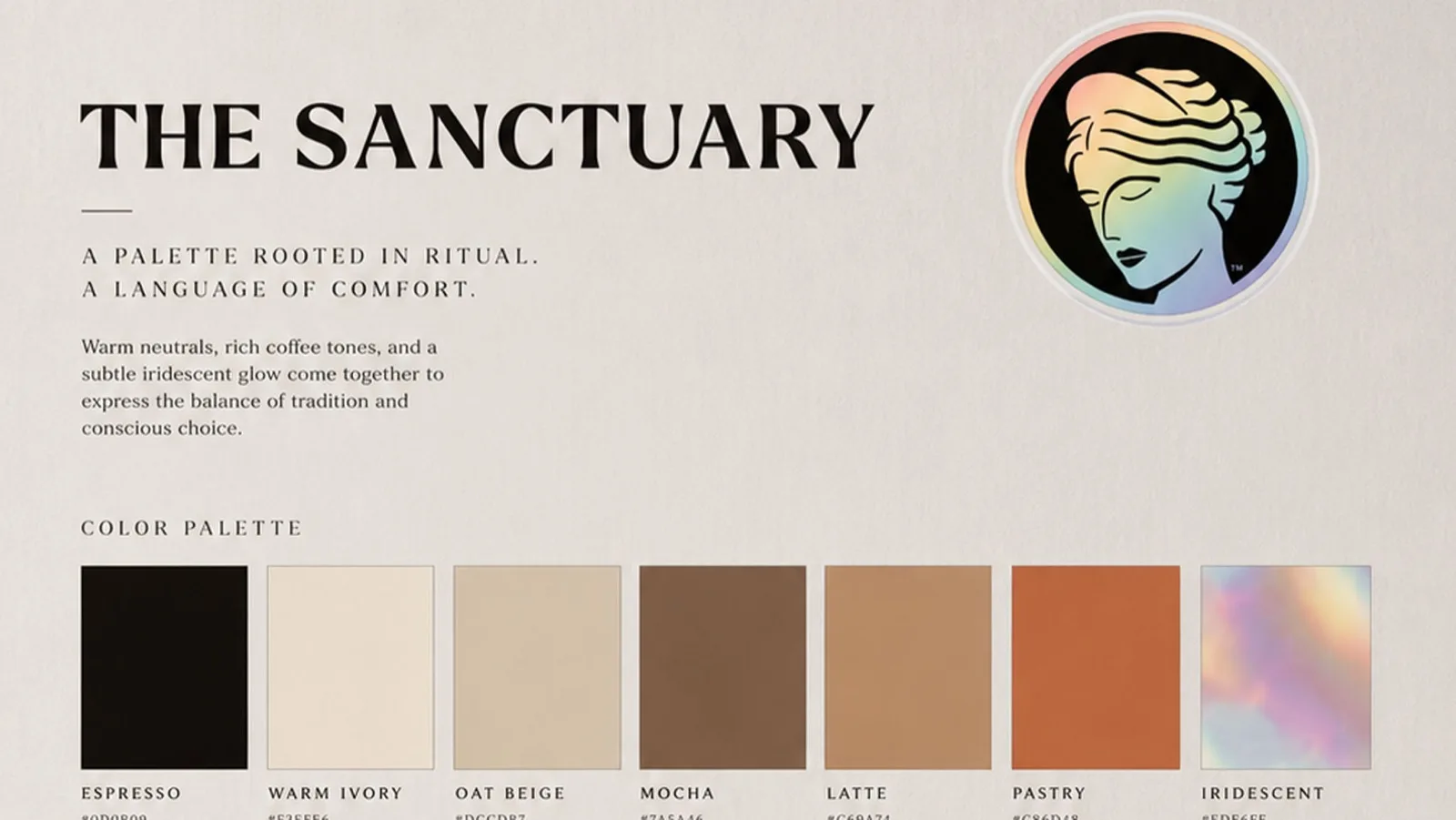
A complete visual language: an emblem, a display and supporting typeface pairing, a palette rooted in coffee and warm neutrals with an iridescent accent, and a set of graphic motifs — pastry spiral, coffee crema, emblem form.
Material and finish were specified alongside the artwork, because on this brand the paper stock carries as much of the message as the logo: matte uncoated, warm foil, deboss.
The system
Five design principles — ritual, comfort, balance, conscious, timeless — written into the guidelines so the brand can be extended by people who were not in the room when it was made.